
Stop Learning, Build This PRO Dashboard in 45 Minutes
Have you ever completed a Python or Machine Learning course, worked with Pandas DataFrames, and still felt confused when asked to “find insights from real data”?
You’re not alone.
Most students understand syntax but struggle with applying it to real-world data analysis using Python. That’s why in this Super Sunday Project, we focus on building a complete Sales Dashboard Project using Pandas and Streamlit—something that reflects actual industry use.
Instead of learning more theory, you will build a professional data analytics dashboard that transforms raw data into meaningful insights.
Why This Sales Dashboard Project Matters
This is not just another Python project—it is a real-world data analytics project.
Companies rely on dashboards to track performance, identify trends, and make decisions. In this project, you will learn how to build a Sales Analysis Dashboard using Python, just like a data analyst would do in a real job.
- For Students: This is a resume-ready Python project for BCA, BTech, and Data Science beginners
- For Professionals: It demonstrates how to build a Streamlit dashboard without frontend frameworks
By the end, you’ll not only understand Pandas—you’ll know how to extract insights from data and present them visually.
The 45-Minute One-Shot Project (Streamlit + Pandas)
This entire Python Sales Dashboard Project is built in one sitting.
You will learn how to go from raw dataset → data processing → interactive dashboard using Pandas and Streamlit, which are essential tools in data analytics.
👉 Watch the full step-by-step implementation in the video.
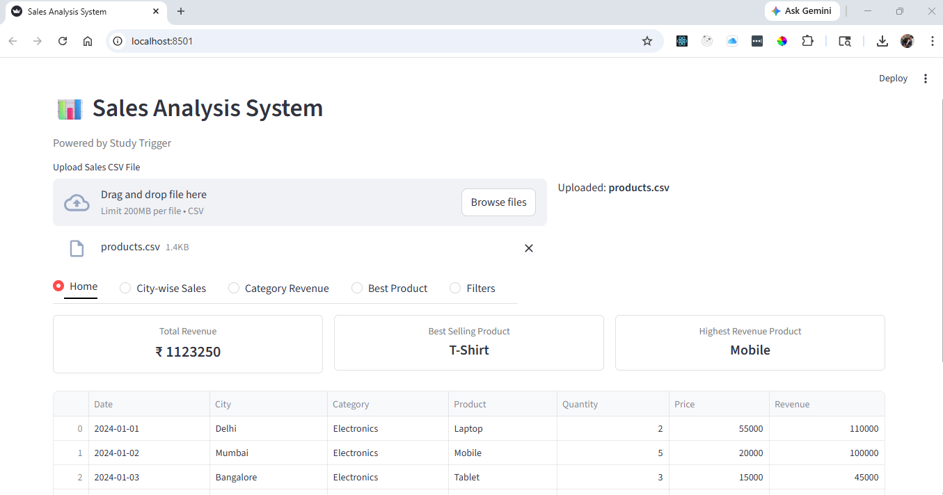
Key Features of the Sales Dashboard
This project focuses on building a fully interactive data analytics dashboard with real business use cases.
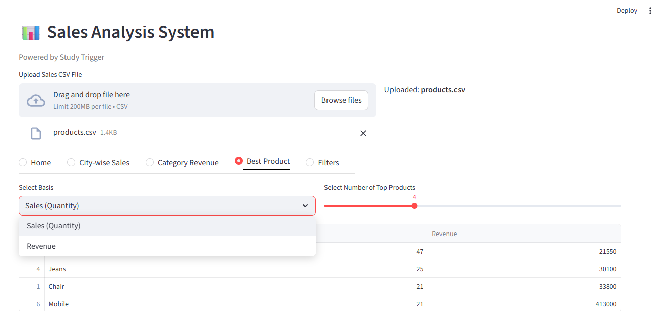
Insight Generation using Pandas
We use Pandas DataFrames to calculate total sales, analyze profit margins, and identify top-performing products. This is the core of any data analysis project in Python.
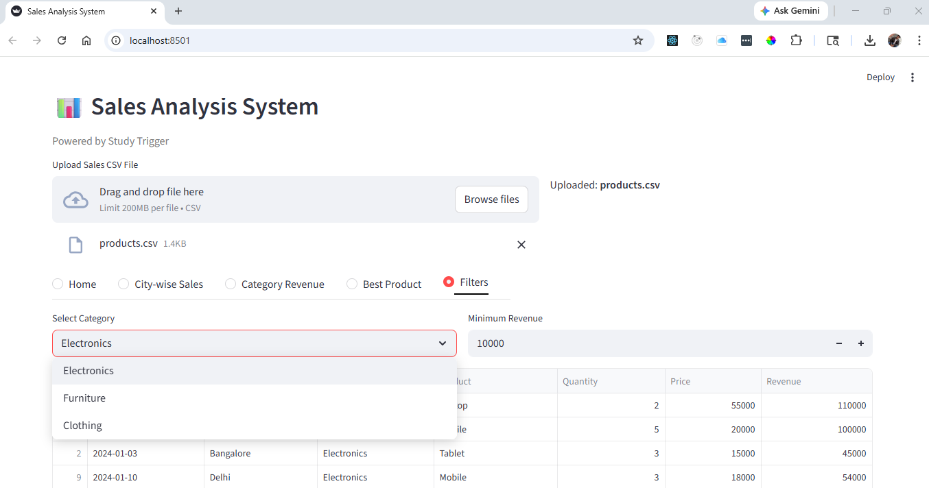
Interactive Dashboard with Filters
Using Streamlit, we create filters for date, region, and category. This makes the dashboard dynamic and similar to real business intelligence tools.
Data Visualization and Reporting
We use charts and KPI cards to represent data visually, making it easier to understand trends and patterns—an essential skill in data visualization projects.
Dataset for Sales Analysis Project
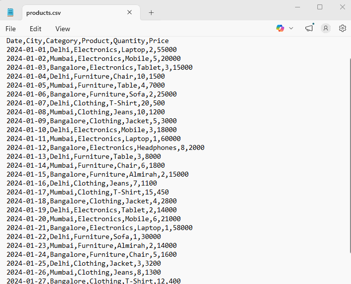
This project uses a structured dataset with:
- Order Date
- City
- Category
- Product
- Qunatity
- Price
This type of dataset is commonly used in sales analytics and business reporting dashboards.
👉 Download dataset here: Click Here
Watch Full Video here :
How to Perform Data Analysis (Real Skill)
The most important part of any Python data analytics project is asking the right questions.
For example:
- Which month had the highest drop in sales?
- Which region is underperforming?
Using Pandas, we convert these business questions into actionable insights.
This is what separates a coder from a data analyst.
Common Mistakes in Streamlit Dashboard Projects
While building this Sales Dashboard using Python, beginners often face:
- Incorrect date formats → breaks filters
- Poor layout → reduces readability
- Slow performance → due to no caching
Fixing these makes your project look more professional and industry-ready.
Bonus Features to Upgrade Your Project
To make your dashboard project stand out, try:
- Adding advanced filters
- Creating Top 5 products section
- Implementing dark mode
- Deploying your Streamlit app online
These enhancements turn a basic project into a portfolio-level data science project.
How to Run This Python Sales Dashboard
- Install required libraries:
pip install streamlit pandas plotly - Download dataset
- Run the app:
streamlit run app.py - Access full source code on GitHub
About the Super Sunday Project Series
Every Sunday, we build a real-world Python project focused on Data Analytics, Streamlit dashboards, and practical applications.
These projects are designed to help you build a strong portfolio in data science, machine learning, and Python development.
Final Thought
If you want to succeed in data science or analytics:
Don’t just learn Pandas.
Don’t just watch tutorials.
👉 Build projects.
👉 Solve problems.
👉 Create dashboards.
That’s how you grow. See you in the next project 🚀
❓ Frequently Asked Questions (FAQ)
1. Is this Sales Dashboard project suitable for beginners?
Yes, this project is designed for beginners who have basic knowledge of Python and Pandas. Even if you are new to Streamlit, you can follow along and build the dashboard step by step.
2. Which technologies are used in this project?
This project uses Python, Pandas for data analysis, and Streamlit for building the interactive dashboard.
3. Can I add this project to my resume?
Absolutely. This is a real-world data analytics project that demonstrates your ability to work with data, create dashboards, and generate insights—making it highly valuable for resumes.
4. Do I need frontend knowledge like HTML or React?
No, Streamlit allows you to build professional dashboards without requiring frontend development skills.
5. How can I improve this project further?
You can enhance this project by adding advanced filters, deploying it online, improving UI design, or integrating additional datasets.
6. Is this project useful for Data Science and Data Analyst roles?
Yes, this project helps you understand how to analyze data, extract insights, and present them visually—key skills required for data-related roles.
7. Where can I find more projects like this?
You can explore more real-world, one-shot projects in our Super Sunday: Project Series on YouTube. Each project is designed to help you build practical skills in data analytics, Python, and development.
👉 Watch the full playlist here: Super Sunday : Project Series